SPESATI
Mobile Web
Mobile Web

COMPANY
Spesati is an international online grocery shopping website based in Italy. The online grocery store delivers high quality Italian produce to Italy and beyond.
PROJECT GOAL
Based in Italy, but gaining global attention, Spesati needs a better solution for its sign-up and check-out process for its global audience.
ROLE
User Research, Information Architecture, Interaction Design, Visual Design, Usability Testing, Prototyping
DURATION
1.5 months
CONTEXT

Bounce rate of Spesati’s Sign-up page. 40.05% is the average bounce rate of a signup page.
Spesati reached out for a redesign of their current registration form to focus on senior users and their global audience. Later, Spesati changed the project to find a solution that would increase the conversion of their target users.
Confusion on “Confirmation password/email”
Questions around why the address is required for sign up?
Confusion with address completion overall, for users from different regions.


In the new design, the information architecture was edited to make sure the information we requested for the sign-up flow was absolutely minimal.
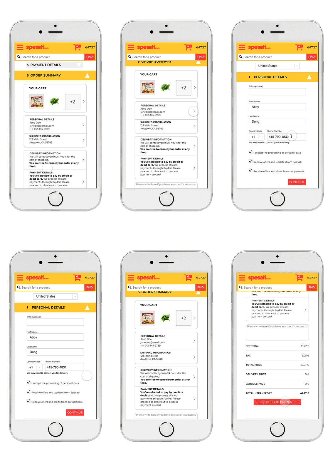
One form doesn’t fit all. We have customized the way shipping information is filled out according to the country where the users are from.


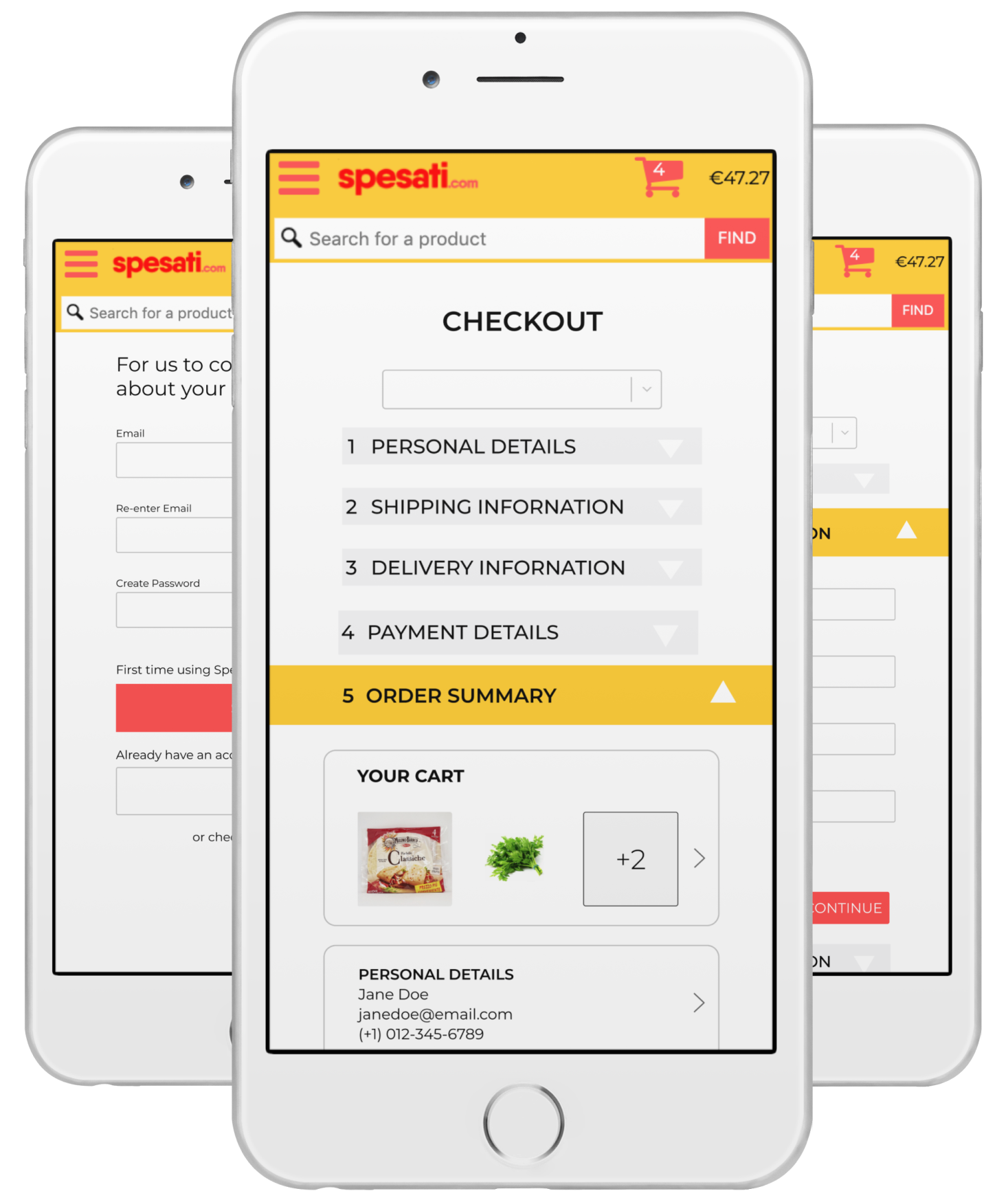
Users can confirm and edit the information that they fill out anytime during the checkout flow by taping on any step tapping section in the summary page.
RESEARCH

Previous User Flow to place an order
USER FLOW:
New users have to go through EVERY step shown above to place an order.
Users do not realize they need to check their email outside of Spesati website to activate the account. (Shown in red arrows above)
REGISTRATION FORM:
Confusion on “Confirmation password/email”
Questions around why the address is required for sign up?
Confusion with address completion overall, for users from different regions.
USER PERSONA

Age: 62
Residence: Sardinia, Italy
Status: Retired
Behaviors:
-- Shop at Amazon mostly for house supplies or anything that is not easy to reach
-- Need to drive (10-15 mins) to supermarkets to buy fresh products
-- Mostly uses her phone to make small purchases
-- May sign up sites that she uses regularly, but like guest check out if it is one time purchase
Needs and Goals:
-- Trust bigger online shopping sites like Amazon, because they have used it before and no problems has occured.
-- Need to know exactly how much they are paying to feel secure, meaning no hidden fees.
PROJECT GOAL
Project goal 1.0 ——>To fix the “What”
Redesign the registration form in order friction the sign-up process.
To set up the research, we had multiple meetings with the clients and dig down to the real reason for redesigning the registration form, so that we can ensure the outcome of our design. Here is what we found:

Project goal 2.0——>To get to the “Why”
With a focus of users who are 50 years old or above, our project goal is to reduce friction during the sign-up and check-out process for the users from different countries, so that users can easily create an account and successfully complete their orders.
CONSTRAINTS
1. Hard to recruit our targeted audience.
Over 50 years old
English speaking
Living in Europe
2. Shipping cost for certain items can’t be shown when check out
Global shipping cost can be very complicated to calculate due to carriers, and certain grocery items need to meet certain standard to be shipped internationally.
3. Payment methods are hard to explain.
Spesati uses Paypal to process cards. Therefore, when users choose paying with cards but be taken to Paypal portal, they get confused and most like to drop their payment.
IA & WIREFRAMES

Our conversations with the engineers helped us nail down to a final flow that is linear and straightforward.
Selected midfi wireframes


FEEDBACK ON SELECTED SCREENS
ITERATION 1
ITERATION 2

Selected Final Screens

RESULTS
At the last round of testing, all users could complete the signup and check-out process without confusion.
We are currently implementing the new design to evaluate success of business metrics below. We are looking forward to seeing the outcome of this project.
Rate of successfully complete the signup and check out process
LEARNING
We certainly underestimated what the work load for “design a form” means at the beginning. In reality, it is a lot more complicated than simply “JUST a form”. Creating a comprehensive form while minimum the users’s workload is almost contradictory.
Recruiting participants internationally with a limited budget was a challenge. Additionally, language barriers, different levels of technical sufficiency, and timezone differences are all factors to be considered when you communicate.