KOALA VISA
ios Mobile app
KOALA VISA
ios Mobile app

COMPANY
Koala visa mobile app is an online marketplace for filling visa applications for Chinese passport holders. It connects the users and the businesses to file visa applications and allows the users to upload digital files and track visa application process.
PROJECT GOAL
Simplify user’s experience of choosing the right business and understanding the application process to achieve a one-stop and personalized experience of visa application.
ROLE
User Research, Information Architecture, Interaction Design, Visual Design, Usability Testing, Prototyping
DURATION
5 days
BEFORE

AFTER
The new design puts the goal first, which is writing a review. The interface shows everything that the users need to do at the very first glance so that they are no longer surprised by or miss hidden questions. All the ratings are integrated into one single interface to inspire users to produce insightful reviews with a holistic experience.

Adding effective filters that collect important information of users’ to filter out listings that are not suitable to users, so that they can make the right choice.
A floating “help me choose button” that guides users to walk through all the required information in order to apply for a visa.


Carefully organized application process and documentation requirements in one screen gives the users a clear image of the process and increase their confidence in applying.
UNDERSTAND NEEDS
Competitive Research

Panda Visa and qianzheng are two competitors of Koala Visa. What stood out the most was how they establish credibility through visual consistency and a personalized approach when it comes to help the users choose a service.
User Interview

To better understand where and what the pain-points are, I conducted 5 user interviews with 5 first-time users of the app who live in China and have not had experience of applying visa to visit abroad.
On the scale of 1 -7, the average score that the users gave for the ease of completion of the tasks during the interviews is 3.
SYNTHESIS
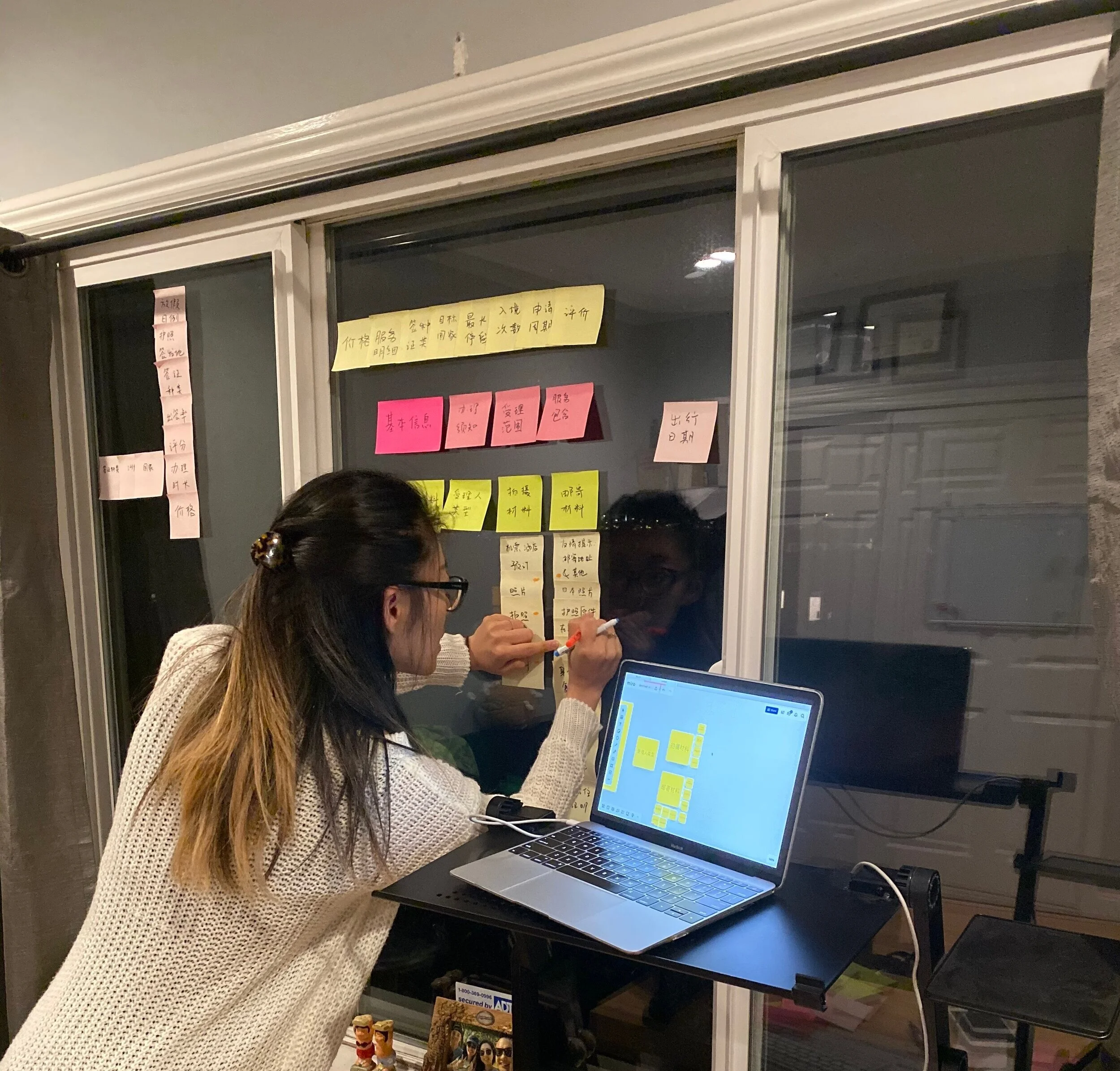
After synthesizing, I found the most problems are concentrated in the process of choosing a right service from the listing and understanding the application process.


All the post-its on the board are the factors that the users need to take into consideration before choosing a right service.
All the red spots are where the process of application is not explained well enough for users to understand.
ITERATION

With the goal to simplify the information or the way the information is being presented to the users, I sketched out multiple solutions to test out.

RESULT

On the scale of 1 -7, hopefully we will see an increase in the average score that the users gave for the ease of completion of the same tasks using the app.
LEARNING
Being outside of China, it is relatively difficult to get the “authentic” view of the market. Therefore, in the project, I spent a lot of time recruiting the real users who live in China and has never been out of the country. I tried to ask more about their context of their behavior than what they actually did during the user interviews, which I think helped me understand my users greatly.
I used to work in administrative positions, and that’s why I understand how important, but boring the tasks are. Most people consider that administrative tasks are not difficult, however, the challenge here is how design can help reduce the boredom and, at the same time, accurately execute.