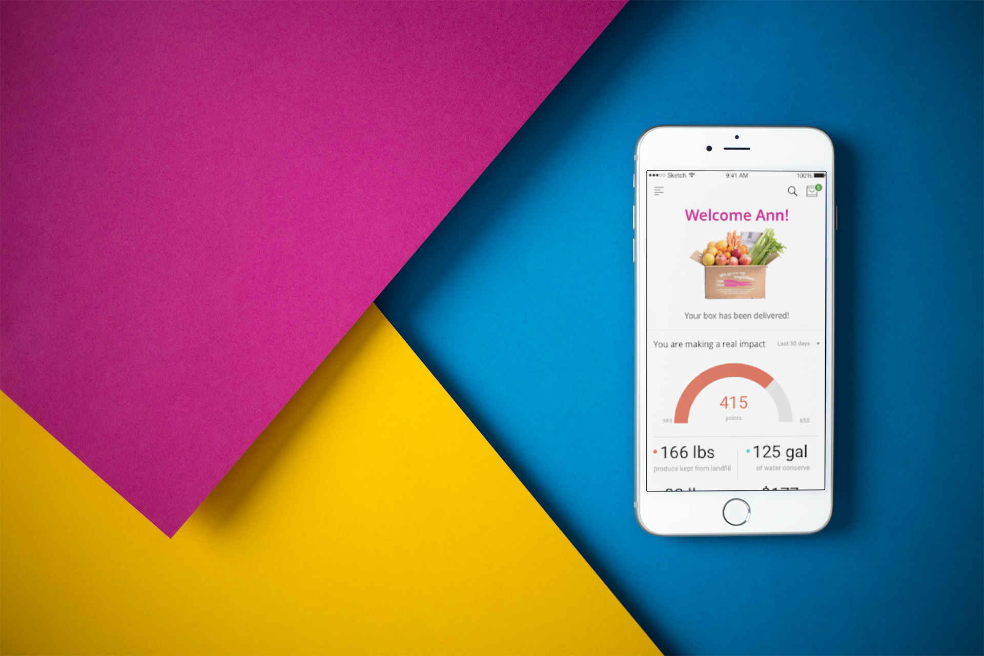
Imperfect Produce is a food delivery company dedicated to fighting food waste by purchasing fresh produce that do not live up to cosmetic standards of grocery stores from the farmers then re-distributing to the market. Feeling the necessity of promoting social good, Team Imperfect, the quartet, has decided to help improve its mobile experience.
Let’s try it!
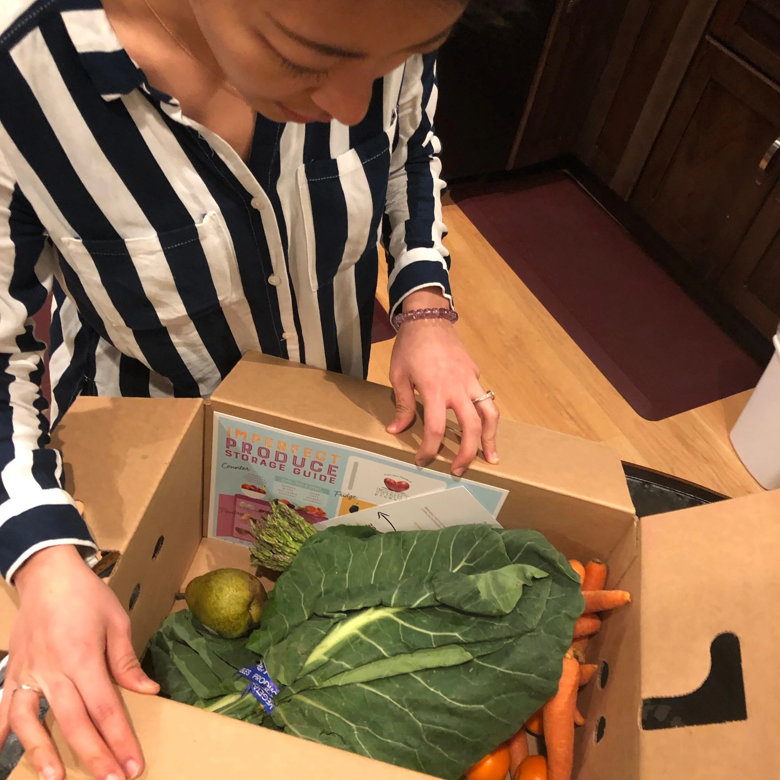
Me, opening my first box of Imperfect Produce.
If we want to improve the user experience of a service, we need to know what problems or pain points users have while using the product. What can we do to find out except for asking the users? The answer iiiiiiis——-being the users!
All members of Team Imperfect hopped on the subscription of Imperfect Produce and started using their mobile site to order boxes of fresh produce.
The Result: 2 and 1 half man, out.
Eric canceled the subscription after his 1st order;
I canceled the subscription after my 2nd order;
Krista has been skipping her subscription aggressively;
Lynn was the only person still ordering boxes every other week.
The problems
Sign-in Confusion
The first screen of their mobile website has only one CTA button which is to sign up as a new customer. However, when the users are existing customers, the users have no clue where to login.
The only button except for the sign-up button is the hamburger button on the top left. However, in the hamburger menu, sign up is still the first thing the users see which they don’t want to. There still isn’t an option to sign in, but a logout option as a third item in the list. At this point, the users are awfully confused.
As an existing customer of the service:
If the user was logged in from the beginning, why would the website keeps showing the sign-up button?
If the user was not logged in, why would the menu bar only show the option for me either to sign up or log out?
User’s disconnection to their impact
While most of the customers know that the quality of the produce from Imperfect Produce is not as satisfying as what they get in normal supermarkets, they still would like to make effort in fighting food waste by subscribing the service. However, the only personalized information that the users can access is merely their order information. This creates a disconnection between the users’ purpose of subscribing Imperfect Produce and fighting food waste.
Our Vision
We believe that designing an Imperfect Produce mobile app with a focus on personalized educational features for existing web-based customers will achieve an educational and rewarding experience for the users, and establish sustainable connections between the users and the products.
Ideation
After a few rounds of brainstorming, we have come up with three features that respectively serve our vision of the project.
Overview Page: Keep on counting
Personalized information of the user’s real-world impact from subscribing Imperfect Produce.
Gallery of Ugly: Keep on intriguing
Users can earn certain rare and interesting fruits and vegetables when the numbers of boxes they order reach certain levels.
Impact Page: Keep on learning
Providing extended information of the impact that the users’ subscription has made and further education on fighting food waste.
My Ideation pad for the gamification feature. The three empty blocks are the CREATIVE BLOCKs!
Wireframe
I took on the mission to design the wireframe of Gallery of Ugly. We wanted to try out the idea of adding elements of collecting to the feature. In turn, giving the users a sense of achievements and reinforce the service content of Imperfect Produce.
“Where there is interest, people like to amass units that add to or complete a set.”
My wireframe for Gallery of Ugly
User Testing
Upon user testing, we learned that users were confused by the lack of predictability throughout the prototype. Since it was a lo-fi paper prototype inserted in the Marvel App, it was hard for users to tell whether the elements are clickable or not. And the key features such as environmental impact were too hidden. Therefore, in our final design we have taken this feedback into consideration.
Finalizing User Flow
After a few rounds of user testing, we pinned down a simple user flow of the three features, which brings the users the biggest cognitive ease to enjoy these features.
That Googly Look
Since Gallery of Ugly is a brand new feature that we added into the experience, we needed to produce more material that will not only inherit the current style of Imperfect Produce but also subtly intriguing so that the users are kept interested.
Our photographer, Krista is getting ready in the studio.
The rest of us brought in the funny looking items that we collected.
The in-house art director, Taco, who is seen here supervising us in her office.
Progress!
Feedback
“Now I know my money is well spent.”
“Wow! There are so many fruits I have never tried before thanks to the Gallery!”
“I got to know so many ways to fight food waste! ”
Celebratory drinks are in order!


